The website had been live for a month and it was all going downhill.
It didn’t start out like this. There were hundreds of hours poured into making everything just right and carefully crafted campaigns sending visitors every day. The first reports showed good revenue and a frankly fantastic sales conversion rate of 3%.
But the next time I looked, it was 2%. Then 1.5%. What was going wrong?
Well, nothing. It was exactly what I expected. But to a stressed-out business owner, these numbers looked terrifying. The site is failing!
Why would two people interpret such obviously bad results so differently?
Watch out! It’s a trap!
It turns out that the human brain is pretty irrational and easily tricked by numbers and probability. We have statisticians and mathematicians precisely because we don’t do a good job of these things instinctually!
When we’re looking at data for our business, there are a lot of data traps waiting to catch you.
But because they’re so common, these traps are well known. They all have names, consistent descriptions and tricks for avoiding them.
Geckoboard have built a really handy Data Literacy section on their website that covers all the big ones and points to even more resources. Before you swing by their website, let’s look at the four most common traps I see in Google Analytics.
Four huge data traps to avoid when analyzing your shop
1. Danger of Summary Metrics
The first thing you see at the top of your Google Analytics Home report is a set of summary metrics.
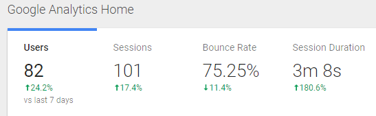
The Bounce Rate is the worst offender when it comes to an average number leading people down the wrong track! The Session Duration runs a close second.
Both of these metrics are USELESS to look at as a site-wide summary, like you see on this report. To take action, you need to uncover:
- The exact pages that have high or low bounce rates.
- Marketing channels, campaigns or search terms sending visits that bounce or have long session durations.
If you focus too much on summary metrics, you could spend a tonne of effort optimizing all your products when it was just a single one with a 100% bounce rate skewing your average!
Google Analytics 4 update
GA4 does this a bit better: by default, the only average metric shown on your home dashboard is “Average Engagement Time”, but you can change this to whatever metric best suits your shop. The other three are actual “count” metrics (i.e. the count of users, new users and conversions). Still, seeing an overall increase or decrease in these summary counts does not tell you why it happened or what you should do – if anything! The trap is still set.

2. Data Dredging
On the other hand, segmenting willy-nilly can cause trouble too. If you look long and hard enough, you’ll eventually find a relationship in your data that looks important (and actually tests out as statistically significant).
How about:
- People from Poland engage with my purple fabric wallet 20% more than average!
- Visitors on a Monday view 80% more pages than on any other day!
- Returning visitors, coming via the search term “tassel earrings”, using a Samsung device, had an average order value of $15 more than anyone else!
The problem is that while all of these observations might be true, it’s pretty unlikely that they actually caused that particular result.
This is where your expertise in your own business is really important, combined with thinking critically about your audience and how they shop. Choose segments that could feasibly influence the results you’re seeing.
3. Sampling Bias
When you’re looking at data inside Google Analytics, you’re generally trying to understand the behaviour of existing and potential customers.
Improve your stats in one easy step (not quite cheating!)
But what if the people who visited aren’t potential customers? The easiest way to improve your shop stats is to simply apply a segment that only includes your target audience. For example, if you only ship to the United States, why analyze the behaviour of people from other countries? (Beyond deciding whether to start shipping there, of course!).
Does your data have a “voluntary response” bias?
Alternatively, you might be trying to understand all your customers but are just looking a tiny slice. And not just because you applied a segment or selected a specific report…
The people who visit your shop “self select” in a variety of ways. This means the visits you actually have data for don’t always represent the people who you’re trying to attract.
For example, the search keywords in Google Analytics don’t include all the keywords you don’t show up for or that don’t give you any clicks (but they might be really great, relevant keywords).
Or a social media campaign might not be shown to your best target audience, so the visits you get don’t engage or buy as much as your ideal customers would. In this case, you might think the problem is with your shop but it was actually your campaign audience definition.
Why was our sales conversion rate so great?
Back to my website launch nightmare… It’s handy to know that an average sale conversion rate is 1 – 3%. The 3.5% rate for the first month was unusually good. Why?
A big part was down to who was visiting the site:
- Friends and family, excited about supporting the new venture.
- “Early adopters” responding to a new brand.
- Local customers keen to try out the novelty of an online store.
Do these people look like they represent the long-term average ecommerce visitor? Nope!
They were self-selected to be more likely to buy. As time went on, the proportion of these visitors naturally dropped – and so did the conversion rate.
This was…
4. Regression to the Mean
Data can – and often does – change just because of dumb luck. That doesn’t mean that things happen through magic, but just that the change isn’t caused by one single factor that you can pinpoint and control. It might not even be something you can fully understand, like stuff going on inside your visitor’s home or head!
When luck causes a particularly good or bad result, that number will naturally move back to the average unrelated to anything you’re doing.
This is a bit of a trap because it can make it appear that:
a) You’ve made a successful change to fix a dropping metric that would have fixed itself anyway. (And what other ramifications or costs did your fix have?)
b) An important number is getting worse (and needs urgent attention!) when it’s just “settling in” to your shop’s average.
Why did our sales conversion rate get worse?
Remember how an average sale conversion rate is 1 – 3%? So 1.5% sounds pretty normal, right?
Well that’s exactly what the rate “settled” to after a few months, as more visitors came and bought products and the site started to behave more like it would in the long term.
That initial drop wasn’t because anything was going wrong.
Of course, that doesn’t mean you should never try to improve your stats! You definitely should and can. But you need to know what the real results are before trying to implement and test any changes.
Ready to become a data expert?
Jump over to Geckoboard’s Data Literacy website.